 I believe the main progression I have made from my preliminary magazine to my final piece is my ability to use various software and different technologies and to understand how a magazine is created and the features and conventions that make magazines appealing to an audience. Firstly I have massively developed my skills in the use of Photoshop. During my preliminary I had very little knowledge of how to use the software.The only editing techniques I knew of were cropping and adding photos. I feel overall after evaluating both my prelim and my final magazine my editing techniques have drastically improved. For example I have learnt how to add text, brighten and contrast photos, how to use the magic wand tool to crop, fill parts of my work with colour and be able to use the transform tool appropriately.
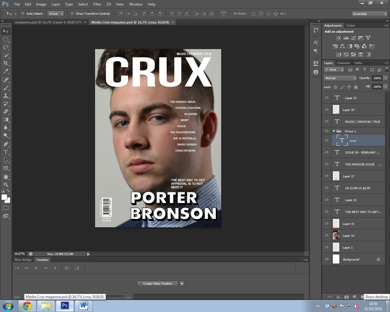
My understanding of what makes a good quality magazine has also improved. The analysis of magazines work really helped me to understand what makes a magazine appealing to my target market and in general. For my contents page I really benefited from research after my preliminary task as it helped me to understand how to make an appealing contents page for my genre by looking at similar magazines as mine such as Clash and Dazed. My appreciation of fonts has increased as I now know that even the slightest change in font style can completely effect the genre that the magazine looks like. For example the first font I used had a slightly western cowboy look to it so it changed the genre of my magazine completely so I had to change it. I learnt how most magazines try and limit themselves to a three colour pallet and often use 3 layouts, Z, F and E. I learnt that these techniques are used to make the magazine look aesthetically pleasing. I took this knowledge to the next level and applied it to my real magazine. As you can see from my prelim everything looks unprofessional. The bar code is out of place and over-sized. Whereas on my finished product it is smaller and positioned more effectively. The masthead on my prelim is too small and has a white background that has no need to be there and looks unprofessional. However on my finished magazine I feel the masthead works effectively and is correctly sized, placed and the colour suits the basic genre of the magazine.
Again more detail needed. Mention the tools on photoshop that you used. Discuss how your appreciation of fonts has increased. Also spend more detail looking at your contents page.
ReplyDelete