Research of relevant photographers, graphic designers, magazine creators
 DAVID CARSON is as an American graphic designer, art director and surfer.He is best known for his innovative magazine design, and use of experimental typography. He was the art director for the magazine Ray Gun, in which he employed much of the typographic and layout style for which he is known. In one issue, he notoriously used Dingbat, a font containing only symbols, as the font for what he considered a rather dull interview with Bryan Ferry (However, the whole text was published in a legible font at the back of the same issue of Ray Gun as well). In 1995, Carson left Ray Gun to found his own studio, David Carson Design, in New York City. He started to attract major clients from all over the United States. During the next three years (1995–1998), Carson was doing work for Pepsi Cola, Ray Ban, Nike, Microsoft, Budweiser and Giorgio Armani. In 2004, Carson became the Creative Director of the Gibbes Museum of Art in Charleston. That year, he also designed the special "Exploration" edition of Surfing Magazine. In a feature story, Newsweek magazine said he "changed the public face of graphic design". In November 1995, Carson published his first book, End of Print. It sold over 200,000 copies in five different languages and soon became the best-selling graphic design book worldwide. I like Carsons work as he used innovative designs that seem to be his own unique style when making his magazine Ray Gun, I will have to think about incorporating some of these aesthetically pleasing ideas when designing my magazine. I will look more into his work and why it was so popular in order to improve my own.
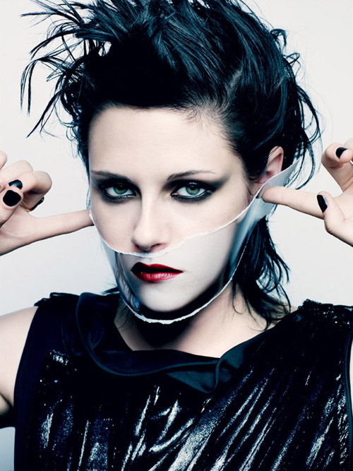 Craig McDean began his photographic career in London as a photographer's assistant to photographer Nick Knight. His early editorial work was featured in magazines such as i-D and The Face, which led to advertising campaign work for clients such as Jil Sander and Calvin Klein, and editorial commissions with Harper's Bazaar and Vogue. More recently, McDean has photographed fashion campaigns for clients including Gucci, Giorgio Armani, Emporio Armani, Oscar de la Renta, Yves Saint Laurent, Calvin Klein, and Estée Lauder. His editorial spreads are regularly featured in magazines including Vogue (magazine), W, and Another Magazine. Although primarily a fashion photographer, McDean has photographed portraits of celebrities including Björk, Madonna, Natalie Portman, Justin Timberlake, Jennifer Aniston, Joaquin Phoenix, Hilary Swank, Uma Thurman, Gael García Bernal and Nicole Kidman. His photos all look like they have a hidden meaning and the person who the photo is of look mysterious and meaningful and I will take this into account when doing my photography. I take an interest in Craig's work as he manages to take such simple photos yet they all seem so have meaning behind them. This could be due to most having piercing eye contact with the viewer and really taking your attention and focus. Not only that, he uses few colours and makes the colours in use stand out and look very vivid and powerful in contrast to the dull black, whites and greys also used. This is something I need to try and incorporate into my own work when making my magazine.

Christophe Brunnquell - was the creator of the magazine Purple,he has widely influenced how many magazines have looked nowadays, this is because his magazine was based on nearly all images, it has revolutionised the way that magazines are created. He has influenced many people to change the way in which they create their magazines, instead of focusing it on writing he has used creativity to just use images. By doing this it gives the magazines its own, unique type and separates it from the other competing magazines. For his magazines he often uses a lot large white area space, this makes me think it is distinctive from other magazines because it is different. He uses images better than other magazines I have looked at have. There is something about his images that are striking and powerful that reach out and grab you. He also uses very little colour and there is something creative and different about each individual image. This grabs the viewer and is interesting to look at. I should try to use his ideas to improve my own work.
 DAVID CARSON is as an American graphic designer, art director and surfer.He is best known for his innovative magazine design, and use of experimental typography. He was the art director for the magazine Ray Gun, in which he employed much of the typographic and layout style for which he is known. In one issue, he notoriously used Dingbat, a font containing only symbols, as the font for what he considered a rather dull interview with Bryan Ferry (However, the whole text was published in a legible font at the back of the same issue of Ray Gun as well). In 1995, Carson left Ray Gun to found his own studio, David Carson Design, in New York City. He started to attract major clients from all over the United States. During the next three years (1995–1998), Carson was doing work for Pepsi Cola, Ray Ban, Nike, Microsoft, Budweiser and Giorgio Armani. In 2004, Carson became the Creative Director of the Gibbes Museum of Art in Charleston. That year, he also designed the special "Exploration" edition of Surfing Magazine. In a feature story, Newsweek magazine said he "changed the public face of graphic design". In November 1995, Carson published his first book, End of Print. It sold over 200,000 copies in five different languages and soon became the best-selling graphic design book worldwide. I like Carsons work as he used innovative designs that seem to be his own unique style when making his magazine Ray Gun, I will have to think about incorporating some of these aesthetically pleasing ideas when designing my magazine. I will look more into his work and why it was so popular in order to improve my own.
No comments:
Post a Comment