Friday, 21 March 2014

7) Looking back at your preliminary task (the school magazine task), what do you feel you have learnt in the progression from it to full product?


I believe the main progression I have made from my preliminary magazine to my final piece is my ability to use various software and different technologies and to understand how a magazine is created and the features and conventions that make magazines appealing to an audience. Firstly I have massively developed my skills in the use of Photoshop. During my preliminary I had very little knowledge of how to use the software.The only editing techniques I knew of were cropping and adding photos. I feel overall after evaluating both my prelim and my final magazine my editing techniques have drastically improved. For example I have learnt how to add text, brighten and contrast photos, how to use the magic wand tool to crop, fill parts of my work with colour and be able to use the transform tool appropriately.

My understanding of what makes a good quality magazine has also improved. The analysis of magazines work really helped me to understand what makes a magazine appealing to my target market and in general. For my contents page I really benefited from research after my preliminary task as it helped me to understand how to make an appealing contents page for my genre by looking at similar magazines as mine such as Clash and Dazed. My appreciation of fonts has increased as I now know that even the slightest change in font style can completely effect the genre that the magazine looks like. For example the first font I used had a slightly western cowboy look to it so it changed the genre of my magazine completely so I had to change it. I learnt how most magazines try and limit themselves to a three colour pallet and often use 3 layouts, Z, F and E. I learnt that these techniques are used to make the magazine look aesthetically pleasing. I took this knowledge to the next level and applied it to my real magazine. As you can see from my prelim everything looks unprofessional. The bar code is out of place and over-sized. Whereas on my finished product it is smaller and positioned more effectively. The masthead on my prelim is too small and has a white background that has no need to be there and looks unprofessional. However on my finished magazine I feel the masthead works effectively and is correctly sized, placed and the colour suits the basic genre of the magazine.
6)What have you learnt about technologies from the process of constructing this product?


I used the school computers that were available to me. The computer was an Intel core 13 system and edge 10 monitor. This hardware allowed me to access Photoshop, the software I needed to design my magazine. However I did some of my work on my Sony Vaio laptop at home.
This is the editing software I used to create my magazine. After being taught the basics on Photoshop by my teacher and having a play around with it myself I was able to create my draft. I then used my knowledge after I could effectively use the software to help my create my real final magazine. The sort of tools I used on Photoshop include cropping, cropping using the magic wand tool, re-sizing images, changing the colour effects and adding and deleting layers.


The Nikon D3200 is the camera I used to take my photos for my magazine. I borrowed it from the school to take my photos. It is a very good quality camera and I think it reflects that in the photos I produced using it. It was great for a variation in shots as I was able to zoom in very close for a close-up shot and it kept focus and didn't blur or pixel-ate in any way.


I used a tripod to keep my shots steady and at the perfect height and angle. This was very effective as it made my pictures look a lot more professional by using good quality equipment.


I used Microsoft Word to write up my double page spread article as I felt it was the most effective way to structure and display my writing. Also it allowed me to keep a word count on my work so that I could anticipate how much room I would need and how much room it would take up on my double page spread.


This is useful application as it is an online publishing website I used it to upload my word documents and then embed them onto my blog.


I used this application to create a video. It was an effective way to represent my work and pitch my ideas.


This was a very useful piece of kit. I used this to save my work and transfer it from the school computers to my laptop at home so I could keep up to date with my work and make progress.


I used Google Chrome, it was vital in my planning and research before creating my magazine.


I used Blogger to upload all of my work online. It was a good method as it allowed me to receive instant feedback from my teachers so I could improve and adjust my work. It was also a good device as it displays my work easily online and I can't lose any of my work.


I used Flickr to upload all of my photos on to the internet to an easily accessible source that kept my photos in good quality so that I could use them whenever I needed to instantly.


5) How did you attract/address your audience?

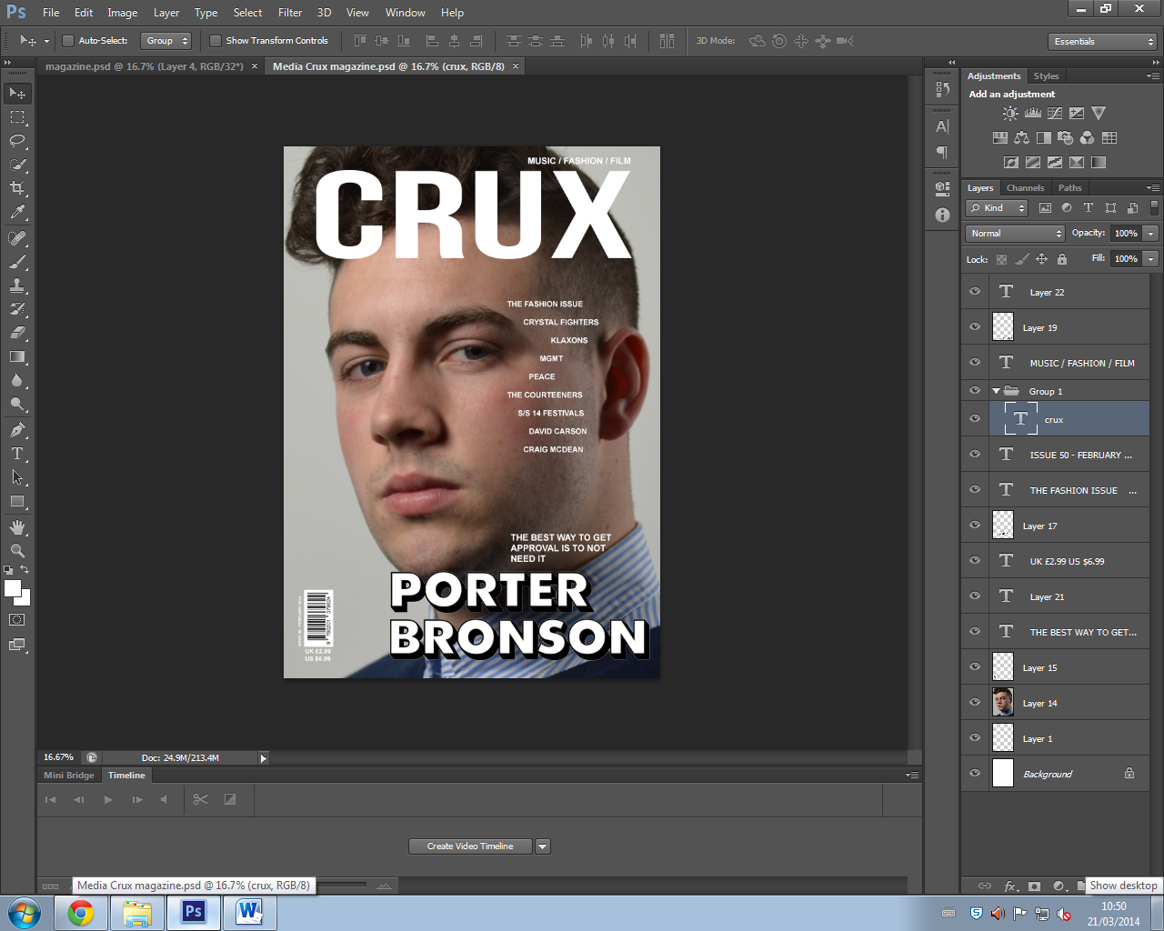
I am aiming my magazine at males aged between 15-23 that have an interest in indie music and a hipster fashion sense such as wearing clothes from shops like Wellgosh and Urban Industry. My magazine has a formal but casual feel of an NME or Q magazine but also be more adventurous to alternative genres like the Rolling Stones magazine. However I might also incorporate a feel of Clash magazine too by using ideas from their basic and simple but effective display of a magazine. I am targeting the indie genre market as I feel there isn't a consistently indie magazine out there for them to get hold of and read as I feel it is a niche market this makes it perfect to release my magazine. I am aiming this magazine at people through featuring bands they like such as Peace, Crystal Fighters, The Neighbourhood and Cage the Elephant and through displaying fashion that these sorts of hipsters will be interested in. The bands I have decided to include in my magazine are predominantly British as that is where my magazine will be sold so it is more relate able. My magazine has a simple layout and design with a simple colour scheme. I have purposely chosen this style as it will attract my specific target audience. I researched other similar magazine styles to how I wanted to create mine. I found that the simple magazines (Clash) fair well and have a more alternative audience which is what I am aiming for. My models will also appeal to my audience as he looks similar to them and they will pick up on this and may want to give it a read. This is because my models are young and look like indie scenesters/hipsters so this will attract that type of audience. My language will also hugely influence who reads my magazine as if it incorporates to much slang then that might put off some of my potential readers. I have used pull quotes to attract my genre of audience such as on my front cover a quote from my artist says "The best way to get approval is to not need it" which is an arrogant quote to attract that type of audience. This is why I have decided to use formal language in my magazine. I think the price of my magazine will also hugely influence who buys it. Pricing it at £2.99 makes it no too expensive and quite appealing for my target market (15-23) who may not have loads of money. Overall, I feel I have done a lot of things to attract my audience and address them in an appropriate way. I think I achieved this by focusing on my target audience and the wants/needs of my audience for a magazine. I also spent a lot of time to make sure the way I have represented my artist to appeal to the audience whilst still fitting the part in a realistic magazine. What I have included in my magazine is also focused around what I know people who would consider buying the magazine would like, as my friends fit the part of this audience.

4) Who would be the audience for your media product?

An example of my audience is a student, Jack Wildbore from Leicester. He currently works at Leicester City football club in the club shop as a sales assistant. Jack loves his music and has recently taken a liking to the alternative music genre. He listens to bands such as The 1975, Foals, Crystal Fighters and other similar bands. This is the exact music genre / fashion and style type that I am using as the theme for my magazine meaning Jack will be interested in what my magazine has to offer. The audience I am targeting is 15 to 25 year old males and Jack fits this category as a 17 year old lad making him a good audience profile. Jack would come under the Indie Scenesters tribe as he likes to wear clothes that make him different in a crowd. Also he attends festivals and is attending Reading festival this year for the third year running. Jack also likes to find new music and has a spotify account which lets him access loads of different music and he can search for related artists and find new music that he enjoys.

To research for my audience I used the website Chanel 4 UK Tribes and looked at the different types of people that would potentially read my magazine. I found Indie scenesters, this is the category Jack falls into. The information I have gathered form this is that they are the type of people that go searching for new upcoming music. Jack regularly goes to see small upcoming bands and local gigs in search of finding something new. They also have reputation to bring back the fashion earlier periods in time such as bringing back the flares look most recently which has come from the 80s time period. Jack could also be associated with indie scenesters in this way as he likes to wear baggy flared jeans on occasions and other clothing such as bomber jackets and Westfield wax jackets. I could use this fashion element for my magazine because it will keep my audience happy when reading it as they will be able to relate to the magazine. Another thing about Indie scenesters such as Jack is that they are attend festivals, so this could be used in my magazine as I could interview bands and also the indie scenesters that have been to a festival like Reading or Leeds or Glastonbury. I then chose Hipsters to be another genre of people who would read my magazine as their dress sense matches the type of music featured in my magazine e.g Peace, Crystal Fighters. Also the type of clothing that  would be in the magazine because that would also match what hipsters wear. My magazine would be distributed in using paid circulation and customers would have to subscribe or go to niche market shops to buy the magazine. This is good for my target market as they wouldn't want to buy it from a common store, they would rather use another method.


3) What kind of media institution might distribute your media product and why?

Bauer - Bauer Media is a division of the Bauer Media Group, Europe’s largest privately owned publishing Group. The Group is a worldwide media empire offering over 300 magazines in 15 countries as well as online, TV and radio stations. Bauer Media is a multi-platform UK-based media Group consisting of many companies collected around two main divisions – Magazines and Radio - widely recognised and rewarded as being industry innovators. Bauer could publish my magazine on global scale as it is a multinational business. It would allow audiences from other countries to see my magazine and appreciate it. Bauer publishes more niche market magazines therefore my magazine may be in with a shot of being published by them. Bauer publishes Q magazine and Kerrang which are both magazines targeted at a niche market as is mine therefore Bauer may be interested in my magazine. Looking at the type of magazines Bauer Media Group is associated with, I feel I would most likely make the publication of the magazine weekly with a fixed price, that could be cheaper if the reader was to subscribe for a longer period of time. Q magazine is an example of a magazine distributed by Bauer. It is distributed through paid circulation and sold monthly via subscription or could be bought in specific music type stores. My magazine would be distributed in a similar way using paid circulation and customers would have to subscribe or go to niche market shops to buy the magazine.
2) How does your media product represent particular social groups?

My magazine represents the 'indie scenesters' social group and I have designed it in the way I have to come across with the type of genre in mind to attract my target audience. I used the black, white and grey colours to mirror a similar effect to Clash magazine and keep the indie theme. The camera angle is important as the close up is clever as my magazine is solely about the artist and this represents that as the close up captures just the artist and nothing else is needed. My models facial expression is important. This is because it is a serious magazine about the music therefore the dull facial expression portrays the genre well. My model Porter Bronson has similarities with Jake Bugg, Matt Healy, Harry Koisser and James Righton. Although Jake and Porter have different hairstyles, they both fall into the same category of indie scenesters. They are both of a white ethnicity and most indie scenesters tend to be of that ethnicity. In terms of costume they have similar fashion types, both opting for the smart casual look. They both have chosen a pattern shirt that isn't simple and outer wear such as a sweater or jacket that is smart/casual. Also I have mainly represented men as my target market through my magazine as my media product mainly has photos of male artists/bands.


Tuesday, 18 March 2014

1. In what ways does your media product use, develop or challenge forms and conventions of real media products (i.e. of music magazines)

When developing my magazine I was largely influenced by Clash magazine. My magazine has a similar title to the one of Clash magazine.

As my magazine is called Crux my magazine is visibly similar to the Clash magazine title, keeping a similar font to match the genre and the same basic white colour to keep it simple, yet professional looking. Also as Crux is only 4 characters and Clash is 5, I decided to make my title slightly bigger to compensate for this.

When thinking about my graphology and page layouts I challenged the idea of not sticking with a Z, H or E basic layout and tried something a bit more unique. My magazine has no immediate design layout as it is meant to be simple looking and show off the image with little text to compliment the image. I have designed this similar in a way to Clash magazine but also tried to put my own twist on it.

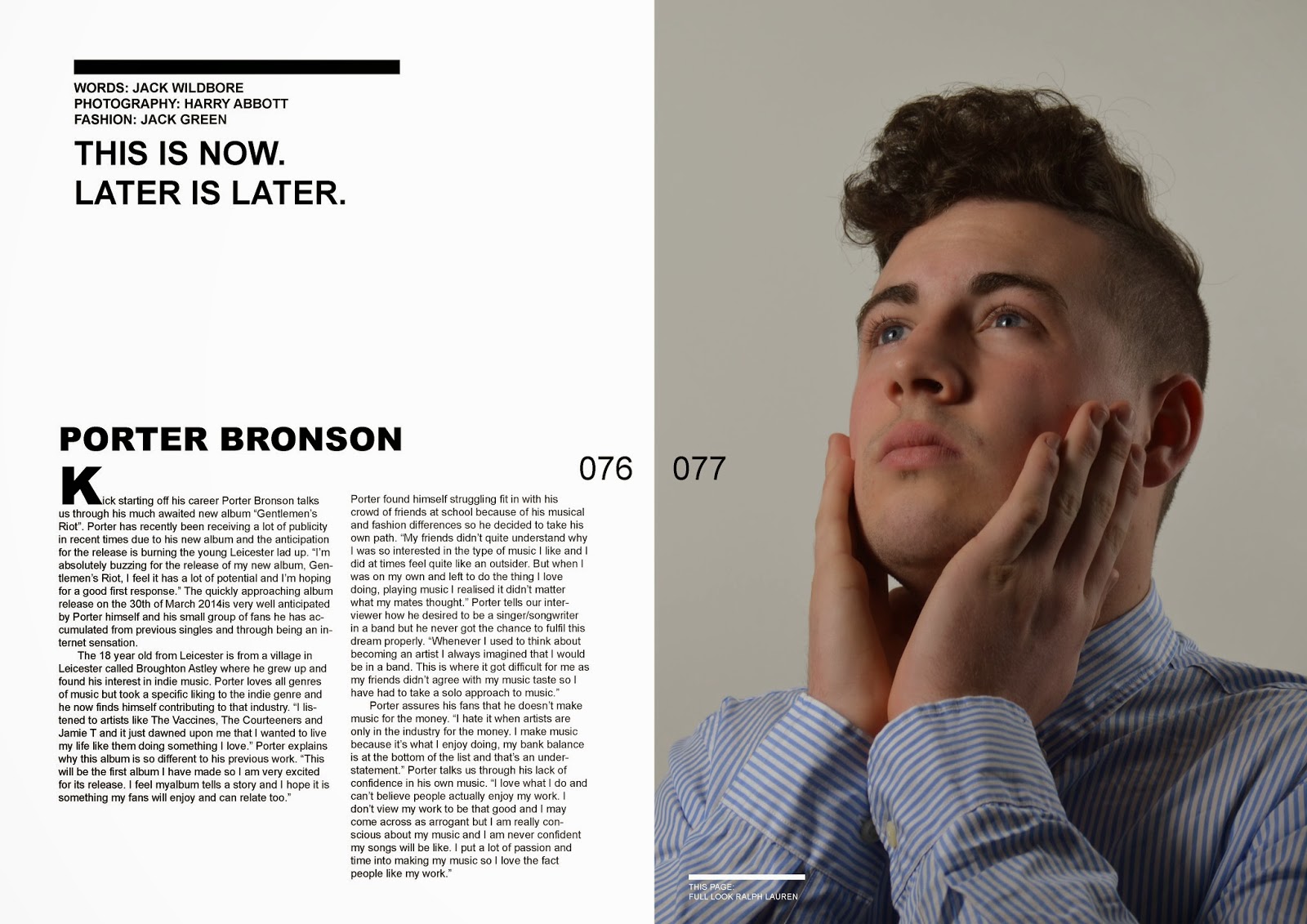
The costumes, props and iconography I used were clever to attract my target audience. This is because I found that as Clash is a very fashion influenced magazine it is vital if my magazine is to look professional that I focus on the fashion of my magazine too. My model can be seen wearing Ralph Lauren on the front cover to look smart and sophisticated even though it may not be his ideal fashion type. However on the double page spread third page my model can be seen wearing more casual clothing such as a hat and tee-shirt which suits his fashion type more and shows a variation in fashion. For my models hairstyle I have had no influence in deciding on what it should look like. I felt that the curly/waviness of his hair gives him a slight edge of not caring which suits his personality. However it is styled quite neatly which contrasts that thought and keeps the smart theme.

For the Camera work and framing of my images I have specifically chosen a close up photo for my front cover. When researching Clash magazine it seemed like the best looking most professional choice of photo would be to choose a close up photo. This also worked well as my model is very photogenic and a close up is well suited to my magazine. Also the framing of the photos is well presented. I have no key features of the photos missing, also all of my photos are centrally framed and have a good CVI. Another thing is that on 3 out of 4 of my photos, the model is making eye contact with the reader which is a very powerful tool when attracting your target market. My main double page spread photo I have purposely made the model look away from the camera as it is an over posing photo from where I have taken inspiration from Clash magazine.

When deciding on my style and font for my magazine I tried to keep it basic as I feel it is more suited to the genre i'm targeting. My masthead font is called Bebas Neue and it is a simple font and very bold to enforce power and attract a potential readers attention. My headers font is a font downloaded from a website called dafont. I specifically chose this font as I felt it looked sophisticated and different as the shadow effect it has creates this feeling. The font I used for my double page spread is Ariel, I chose this font as again, it is simple yet effective and my target market doesn't want to be reading anything fancy.

I decided on a really unconventional contents page that included no images and was very basic using just black and white. I did this as I felt it created a different effect that would suit the genre type of my magazine. Also as the front page and double page spread is simple design I decided it would look out of place and unprofessional to make a contents page that was busy like Kerrang or Mojo. My initial idea spanned from inspiration from Clash magazine and I kept a similar contents page design, with a simple layout that works effectively. However I did make my contents a double page layout so I could include an image. This was because I felt I needed another indie looking image on the page to really address and please the reader. Also I feel my magazine is less about the superficial images but about the actual content and whats behind the music as that's what my audience care about the most. But, as I know images are very important in creating a magazine that is why I decided to make it a double contents page and add an image.

The genre I am targeting my magazine at are Hipsters and Indie Scenesters. I feel my front cover helps portray this genre as the model looks like an indie/alternative character himself. Also the whole style of the magazine itself including the front cover, contents and double page spread looks different to most of those it would be placed next to on the shelf. The fashion I have chosen also helps show the genre I have targeted. The clothes are all fairly smart with some, such as the contents page photo having a really indie touch to it. The contents page is similar to one of Clash magazine and is different to most other magazines as it is basic colours and not much variation with colours. The use of no photos on the actual contents page is also different and unique and an idea I have used and created in my own way from Clash magazine.

My artist is represented cleverly as an indie/alternative artist. I have purposely done this to help enforce the genre I am targeting. My artist represents the genre well as his fashion suits the type of people that will be interested in my magazine. Both of my models have an indie haircut and this will help to distinguish the type of genre the magazine is. They both also look arrogant in the photos and have a "bad boy" rebellious attitude about them which again increases the idea that it is a hipster/indie magazine.

The colour scheme of my magazine is simple. I have done this as the examples I looked at (Clash magazine) mainly focused on basic colours and as I have a similar target market/audience as Clash I decided a it would be a good choice also use these colours. Most magazines embrace a 3 colour pallet style and I have tried to reflect this in my work using whites, blacks and greys. This simplicity also helps portray the alternative theme of my magazine.